Puzzler

by Stephen Sladek

July 2, 2018
1154 words, 5 min read

Introduction

The Puzzler project is the fourth project within the Udacity VR nanodegree track. It requires students to exercise in the design process of virtual reality, and to learn how to cater programs to user needs. The student then dives into the Unity3D Engine and utilizes the GoogleVR library to create a mobile VR application. By the end of the project, we end up with a nice game of Simon Says inside of a cool, medieval VR setting.

This project took me around two weeks to complete. Thankfully the process was mostly streamlined due to the resources provided by Udacity, but there were still some hurdles when it came to learning how to tune the application to user preferences. This article covers the process I went through while developing this application.
Design phase

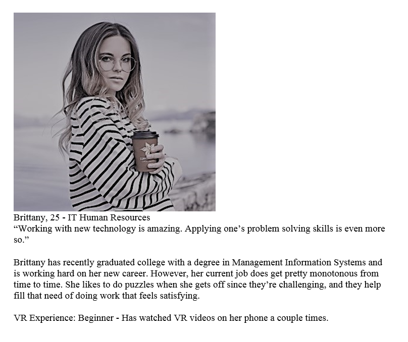
So first things first, who are the users? In my case, I knew my fellow office workers at the university would be my test subjects and so I created a fitting persona. Drinks coffee? Check. Works in IT? Check. A 20-something year old from college? Check.

A made up persona to get an idea of our users.

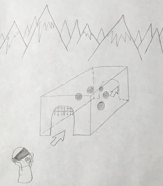
What would users in this demographic want? Probably something that's at least somewhat challenging. Doing a simple pattern game should be challenging, but not too much. The user should also be able to see all of the orbs at once without much effort. Constant turning in VR can cause motion sickness, so it's best to keep the orbs inside their immediate field of view. They'd likely also want something that is either mysterious or vibrant to capture their attention of the area that they are exploring. If the environment is uninteresting, then what's the point of having virtual reality to begin with? The area must be immersive. So with this in mind, I created some sketches to get an idea of what I was going to make before attempting to put it together. I chose to go with a medieval theme inside of a mountain range. It would be amazing, and I already had assets on hand for it.

A rough sketch of the overall scene

Creating the Scene

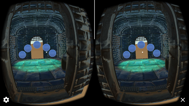
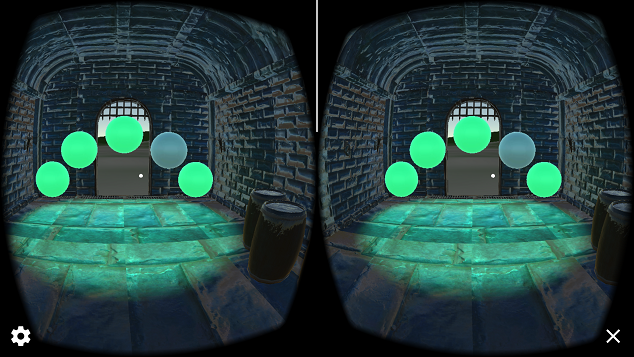
We know who our users are, and we know what we want to make, so it's time to start making it! I used the prefabs supplied by Udacity to put together a medieval looking dungeon and lots of ominous green/blue lighting. I added in the mountain mesh for the surrounding scene and made it brown like a desert. Five orbs were placed within the dungeon to be used later on for the puzzle. Lights are baked to create a pre-rendered lightmap so that we eat up less processing power. Now it's ready for testing.

The initial temple

User Testing


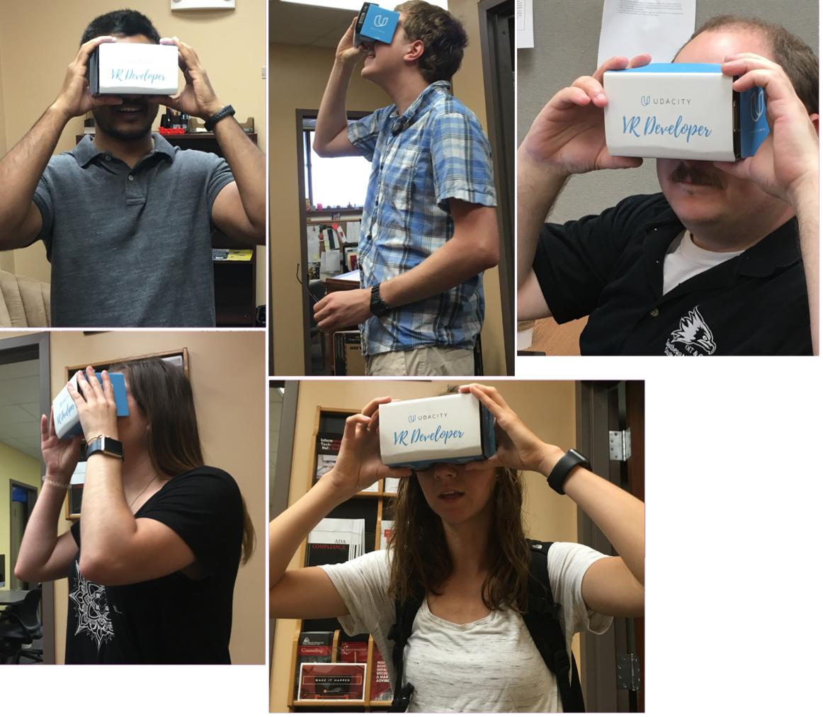
I did some quick user testing for the scene and soon discovered that a medieval dungeon in a desert feels a bit off to some people. On another note, I also found that people who are above 6' tall felt short, while people below 5' 6" felt a little tall. Those who were closer to the average height felt normal.

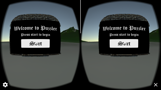
Next, I implemented the start and restart menus. I recolored the mountains to be more green and did some quick testing again.

The start menu

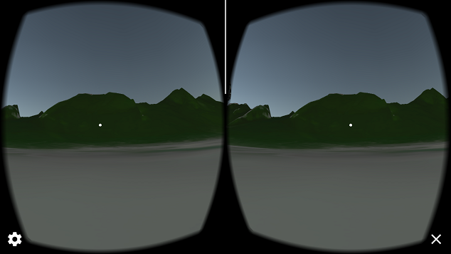
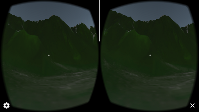
No noticeable problems here, so I go ahead and add in the game play, way points for movement, and audio feedback. Puzzler now actually has a puzzle to solve! The users generally enjoy the experience, but there's a new problem. As most fear when working with VR, some of the users begin to experience some motion sickness. Though nobody got really sick (thank goodness), many of them reported there being too much latency and how the scene was a little choppy while looking around. After some investigation I quickly found that the mountain mesh was scaled up to 50x larger than the original size! I scaled it back down, made sure all objects that aren't interacted with were marked as static, and triple checked that all my lighting was set to baked instead of real time.

The mountain mesh was scaled incorrectly.
Mountain scene after scaled to correct size. The colors are more vibrant and it takes up less processing.

Final Product

With all the performance enhancements and aesthetics done, I finally had a good working product that everyone could enjoy. The project was a success. The motion sickness was minimized due to better rendering; it was challenging enough for the users, providing a nice workout for their short-term memory; and the environment held users' attention with the interesting scenery, and spatial audio ambience to accompany it all.

When the user puts the cardboard viewer up to their face, they’re immediately surrounded inside of a lush green, mountain range with a welcome menu hovering in front of them and the sound of crickets chirping away. Pressing the start button reveals a mysterious grey dungeon that the user is slowly moved into. Inside the dungeon an ominous background music starts to play, and green lighting fills the room. Five orbs hover in front of the user and a pattern is shown. If the user fails the pattern, an error sound is played and they must try again. Should the user be able to repeat the pattern, they will be ushered outside of the dungeon where the cricket chirps resume, and will be given a congratulatory message with an option to play again.

Watch the video below to check out the game play of the final product.

Final Remarks

It was a wonderful experience learning to make a refined VR application and an even greater joy getting to watch people, who have never played a VR game before, become amazed by this new technology! At first glance, this part of the VR nanodegree course seemed to be lacking in information pertaining to virtual reality specifically, but after having done the Puzzler project and gaining hands on experience, I believe that the project was both a well-structured and fun way of helping students to learn documentation, user testing, and a little more about virtual reality from a workflow standpoint.

This project also has some room for improvement. A scoreboard could be created to keep track of how many puzzles the user has solved. Also, the code could be modified such that the number of patterns to memorize could increase, just like in the original Simon Says.

Overall this project has left me encouraged to not only keep working on projects, but more importantly to actually take the time to document my work now. After all, it always helps to get the view and advice of somebody who has gone down a path before going down that same path yourself. And you get to show just how much work went into your project, which leaves one with a higher feeling of satisfaction in their project.