Night at the Museum

by Stephen Sladek

July 28, 2018
2186 words, 10 min read

Introduction

The Night at the Museum project is the fifth project in the Udacity VR Nanodegree track, and the last project of term 2. This project builds on top of everything the student has learned up to this point. The student must build a museum (or something akin to one) that showcases some field or business of virtual reality. As is usual for this track, the entire project is built within the Unity3D engine with the GoogleVR library. The scene created is expected to provide images, videos, or models for viewership; to have a way of movement throughout the VR scene; and to include audio. Documentation and user testing is also a part of the process just as it was in the fourth project.

I managed to complete the project in roughly two weeks. Unlike previous Udacity projects, there are no specific resources handed for this one. This article details the process of this project including all of the challenges I encountered and the end result.
Design phase

I ended up choosing to focus on using Brain Computer Interfaces with Virtual Reality. Personally, I've always been a huge fan of movies such as Tron, Sword Art Online, The Matrix, and the like so choosing a topic related to those came to me with ease. Next, I had to figure out who my audience was and how I should do the layout.

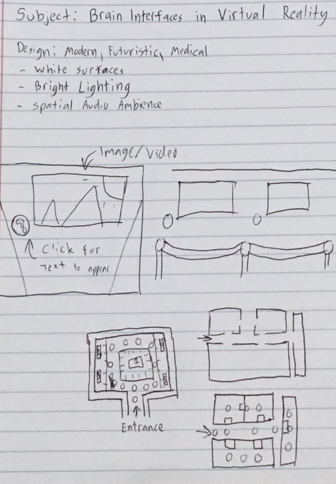
A rough sketch of design ideas for the museum

It's more rewarding to do things yourself, so I wanted to do as much as I could from scratch. I'm comfortable with programming, but I knew that with my lack of 3D modeling skills, I wouldn't be able to get too fancy. Fortunately, white modern layouts aren't too complex, and give sort of a medical environment vibe, which works great for my topic. The layout ultimately ended up looking more like the one at the bottom right of the above sketch.

I knew my direct audience would be college students, since that's what I'm surrounded by, but per say somebody from the medical or technical field would like to see the possibilities of these two worlds colliding? Medical people would need to know about the very basics of virtual reality, and technical people would need to know the very basics of neuroscience. It'd be pretty cool to have some models representing those things, but my modeling skills are minimal so I would end up having to use some already made by others.

The users would also need an easy to use interface. Due to my prior projects, I already know that point and click waypoints are generally easy enough, so we can just stick with that. There also needs to be a way of displaying information and instructions though... I had an image flash in my mind of a little blue ball with a question mark on it, like the ones you commonly see in some programs that you can click for help or info, and so I decided to go with something similar... blue orbs that can be clicked to display text.

Creating the Scene

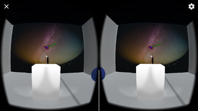
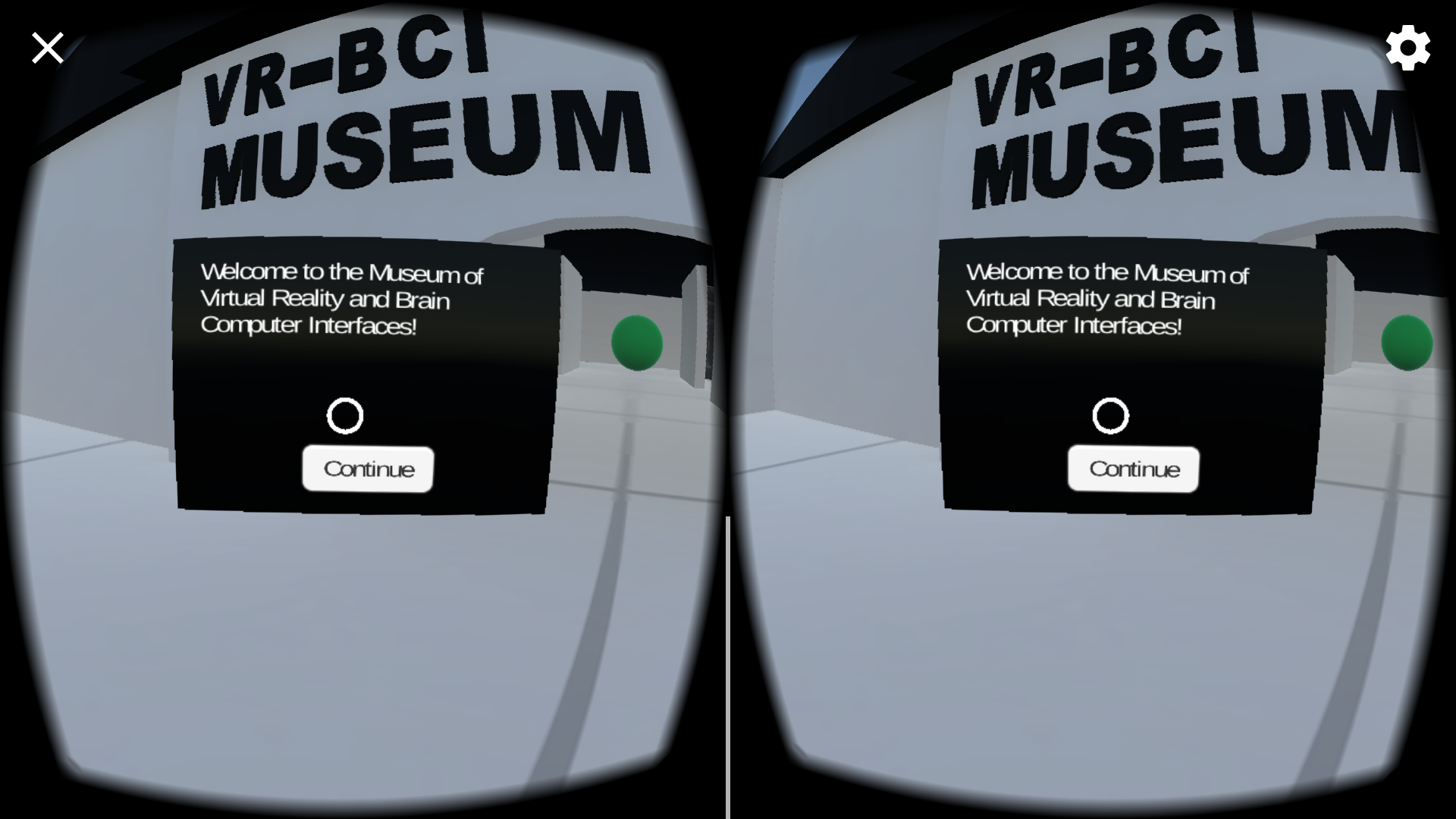
The first blue info orb displays a welcome message and instructions for controls.

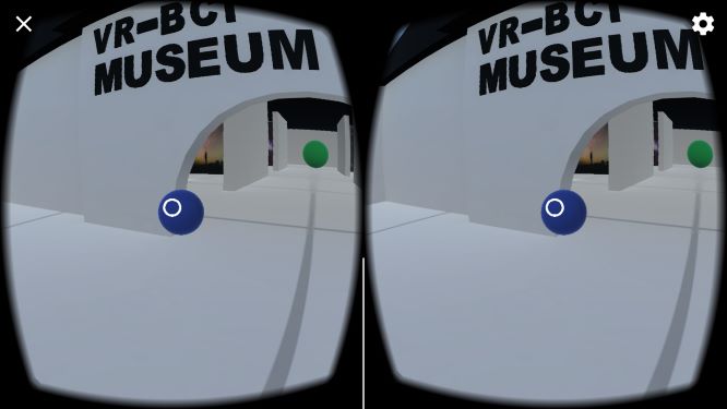
The blue info orbs need to attract user attention to make the user curious about them. I first try making them do a pulsing glow, but then remembered that this needs to be optimized for mobile, and pulsing glows won't work for baked lighting. I instead settle for just making them float gently up and down. I then positioned each orb to face what I would assume to be the entrance for the user.

After the info orbs are set up, I went ahead and put in my waypoints, designated by green orbs. I could reference my waypoints from my previous two projects so this is relatively a breeze to implement. The player clicks an orb and the camera's position moves to the position of the orb clicked on.

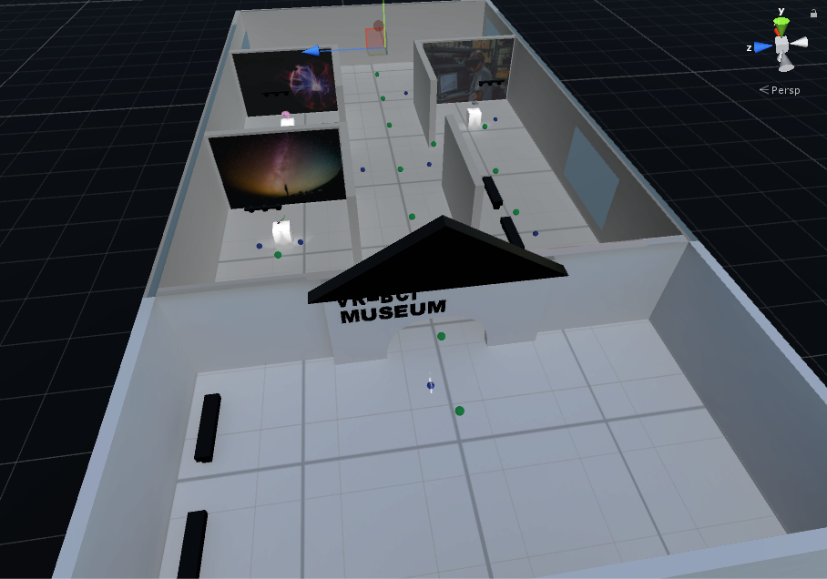
Bird's eye view of the inside of the final layout.

Walls are up, floor is layed down, and the orbs are everywhere. So what's left? The museum still looks a little bland at this point, so I figure I can try my hand at some basic modeling. I don't need anything robust like Blender to do something basic, so I run a search and immediately come across Tinkercad. Tinkercad is amazingly easy to use, and after 5 minutes of tutorials, I'm able to build a bench, a roof, an arched entrance with 3D text, and some light fixtures. I add these in, optimize the light settings however I can, and get ready for some user testing.

User Testing


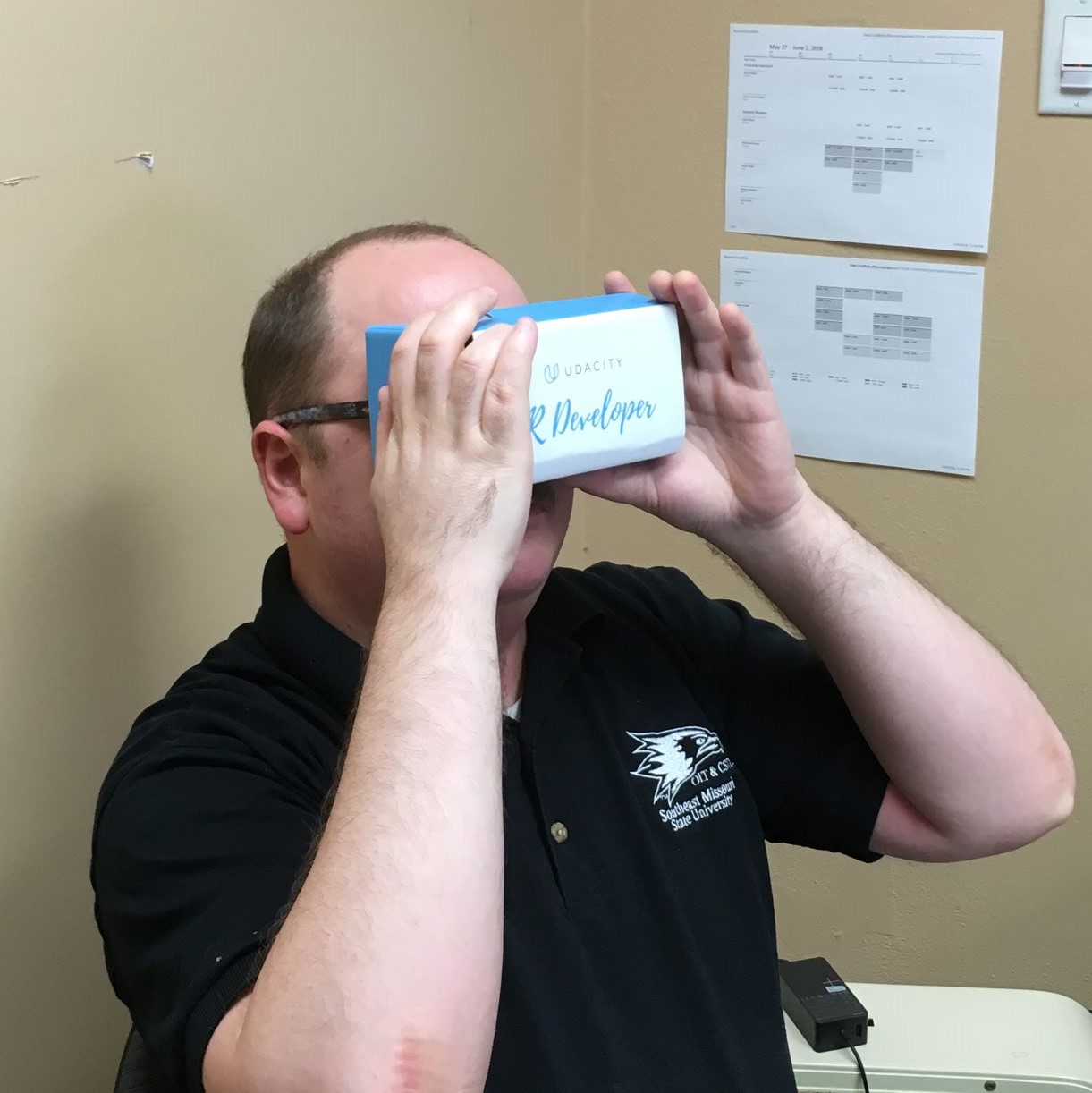
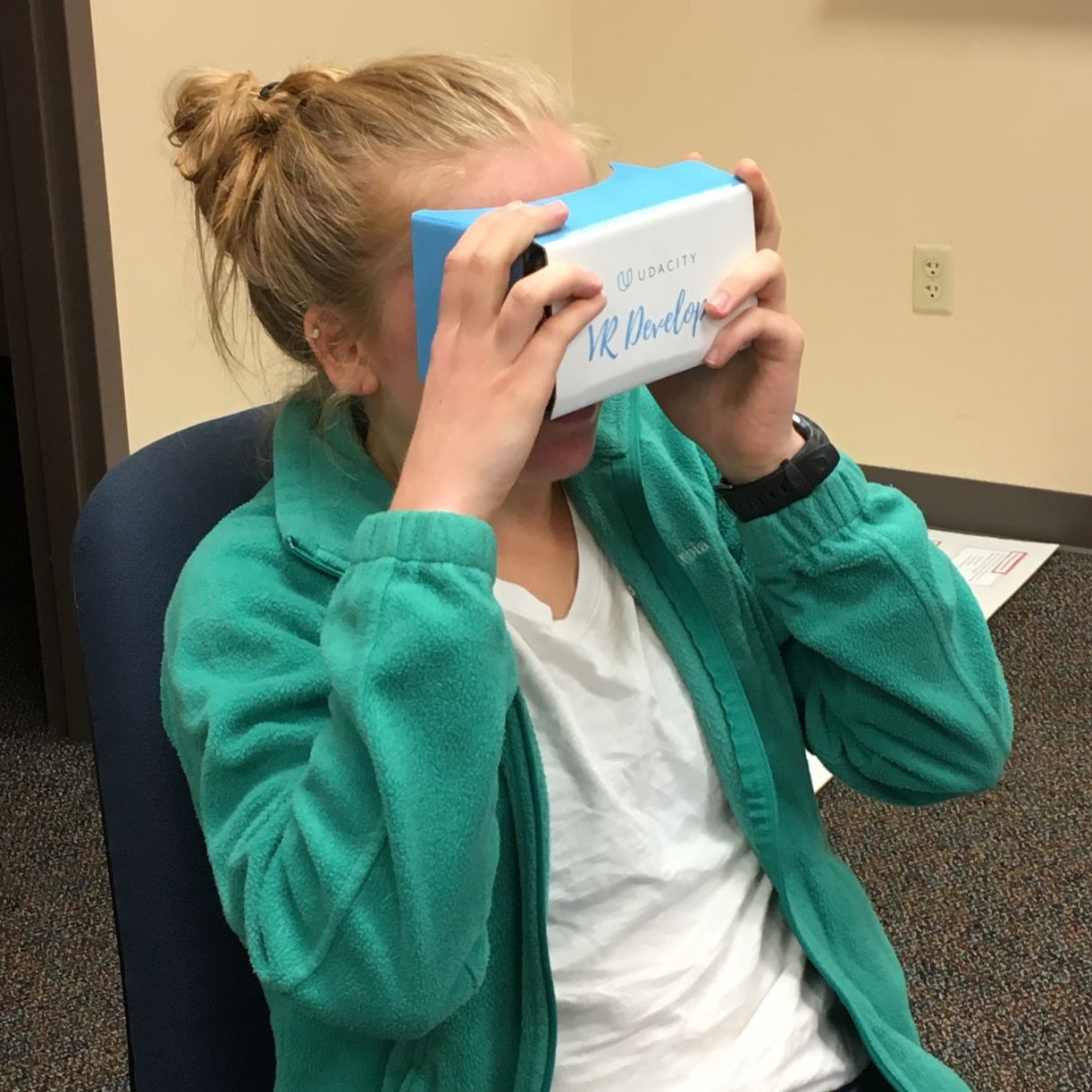
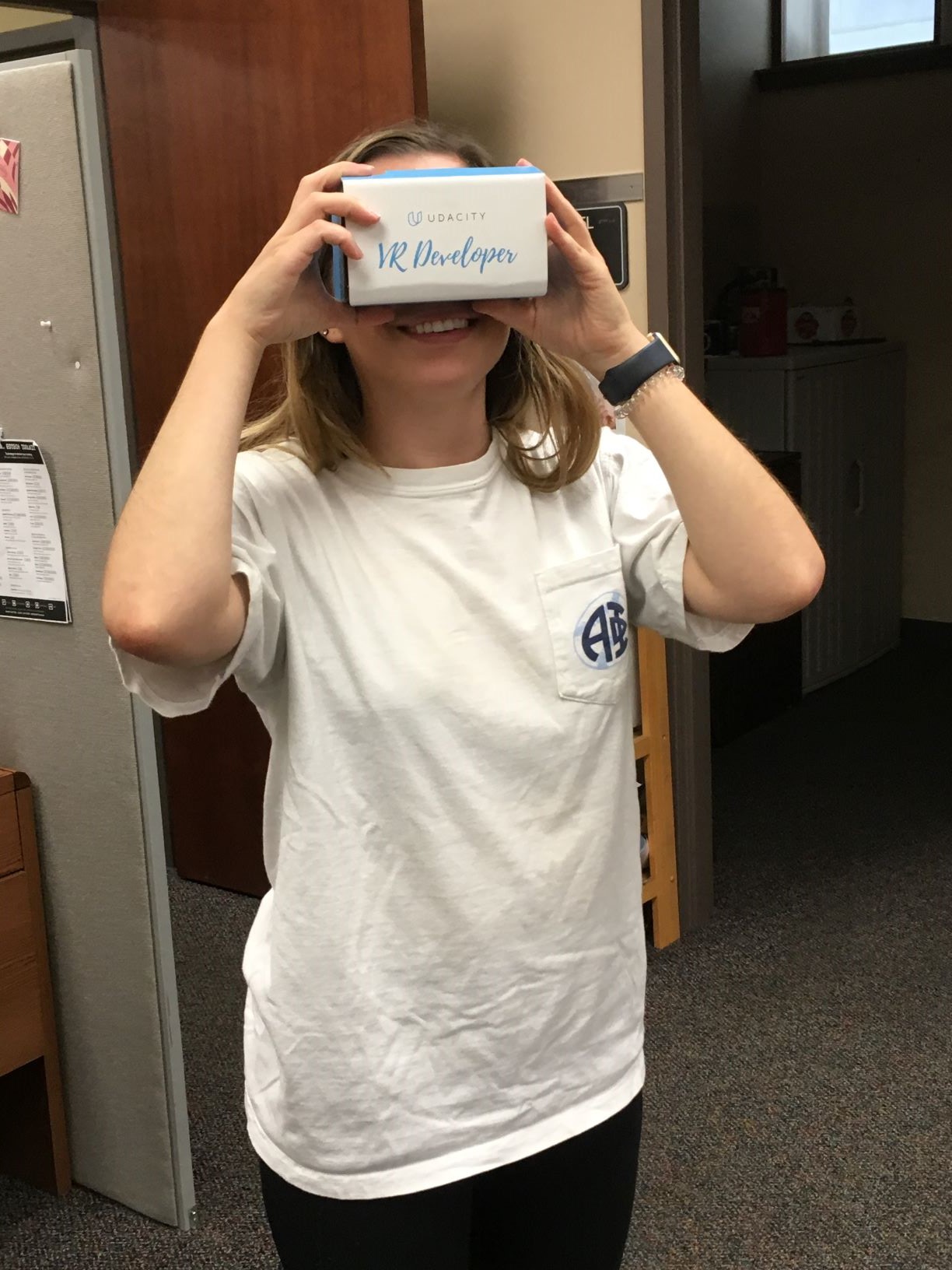
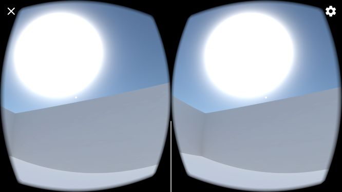
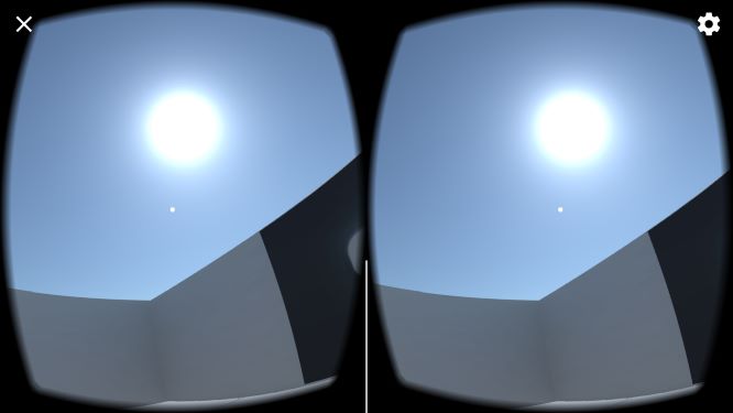
A couple of my users are repeat victims customers, while some of them are brand new to virtual reality. Overall things go better than they did with my Puzzler project. No motion sickness. They mention to me that the sun is strangely large, and that the text is slightly large as well. It also turns out that trying to predict which angle they'll click on the info orbs was a bad idea since they can click on them from multiple angles and won't always see the text. The modern white layout gets reviews of giving off either a laboratory, or artistic vibe, or being like Minecraft since everything is so blocky.

Left: The original sun in the skybox looked uncomfortably large.
Right: The updated sun has a more natural appearance.

I reduce the sun's size 4x, and the font-size from 5 to 4. I make no changes to the layout, since it seemed to be fine, but I remove the lights in the hallway since some users were confused by the random baked dots of light on the wall. The info orb script gets modified to grab the camera's rotation and set the rotation of the canvas to face towards the camera. Next, I implement all the exhibits, videos, and the spatial audio. A cool techno background music is now present in the hallways, and is replaced by an ambient hum when the user goes into a room to view an exhibit. Videos are also given spatial audio qualities, and fade out linearly as you move away from the video screen.

User test round 2. The users love exploring the VR space, and they're all blown away when they begin watching a video in VR. The only issue this time is that there is some lag around the neuron exhibit. The neuron is composed of several models nested together, so I remove some of the excess while retaining the most important components of the model. I also scale it down a bit, and reduce my light settings even further. After a few iterations I manage to make the lag very minimal such that most people no longer notice any. The lag could've also been due to the fact that I'm running the application on an older Samsung Galaxy S5, which is beginning to show its age at this point.

The Exhibits

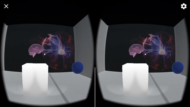
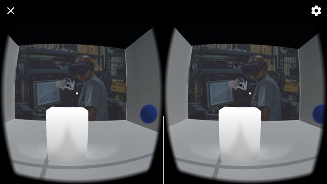
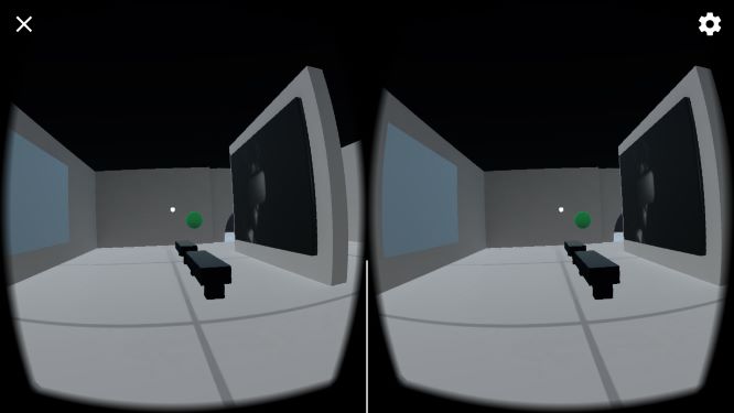
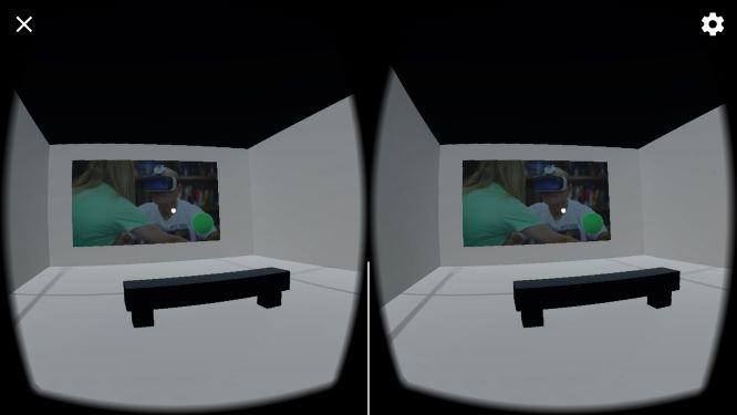
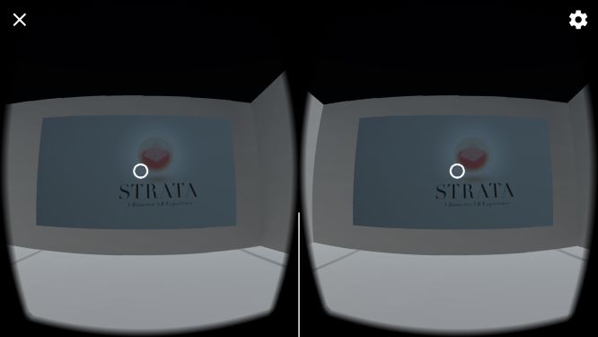
Each exhibit fits within a theme. On the left of the building are the neuron and brain exhibits, which both talk about how virtual reality is intersecting with the usage of brain computer interfaces. On the right side is the virtual reality room, which consists of an Oculus Rift model, two Oculus Rift pictures, and a video about the company, Neurable, who is on the forefront of developing a BCI device for VR headsets. In the back there's a theater room with two screens. On the left is one for StoryUP, a VR company that uses virtual reality to treat depression, anxiety, and more. On the right is a screen for Strata, a company that uses biometric sensors to manipulate the VR scene in realtime based upon neurological input.

The neuron and brain model exhibits
The Virtual Reality room with an Oculus Rift model and video about Neurable
The Strata and StoryUP theater room

Final Product

After all of the fine tuning was done, the application was ready. When users don their phone holder of choice they now enter a bright environment filled with modern white architecture. Looking behind them, the user sees a sun up in the sky and a photo of the backside of a girl's head peering through a window as if to see what is beyond the wall. There's a welcome message hovering in front of the user. Clicking the button to continue gives the user instructions that the blue orbs give information while green orbs are used for movement.

Upon moving into the museum, the user is greeted with a techno beat in the background. Blue orbs hover in front of each entry way that describe the room when clicked. The user can continue clicking green waypoints to move around the museum. On the left side of the museum are two models, a neuron, and a brain. Each model has blue orbs accompanying them to give some information, and also have a photographic backdrop that helps add to the flare of the exhibit. Model rooms are also designed to be away from the techno music so that it fades to the background. These rooms also have a low humming audio added to help provide a white noise to assist in drowning out the music and help the user focus on the what they are looking at. Clicking on the blue orbs at exhibits will provide information about the model accompanied with narration.

On the right side of the museum is a video and a model of the Oculus Rift. Video screens can be clicked to play the video, and clicked again to stop. Videos also stop playing when a different video is clicked on. Finally, in the back room, we have two more videos that can be watched. All in all, the museum hosts 3 models, 3 videos, 5 photos, and 2 audio tracks. Below is a video showing a playthrough of the museum.

Note: The video has had its speed increased to help mitigate file size restrictions.

Final Remarks

The Night at the Museum project was certainly more challenging than the previous projects in Udacity's program. It was the we taught you what you needed, now try flying portion of the track. It was both challenging and rewarding to do though. Working on this project gave me some incentive to learn some basic modeling and also get more familiar with how lighting and models effect performance.

The most challenging portion of this was figuring out how to play video with audio in VR. The GVR video player is exclusively for Google's Daydream, not for Cardboard devices, and would've only worked for panoramic videos anyway, not the flat screens I was using. Also, the direct audio option in Unity's video player component is currently broken. I was using local mp4 videos, not URLs, cause I didn't want the app to be internet dependent, so I had to use the video clip option. After much trial and error, I found that if I make a copy of my video, and set the importer version of the copied video to movie texture, I could seperate the file into video and audio. I would just place the newly seperated audio into an audio source component and use that for my audio output, while using my original video as the video clip. Maybe not the most efficient method, but it worked well.

If I were to revisit this project I would probably add more in-depth information on the exhibits and implement a scoring system for each info orb clicked on. Visiting all the info orbs could unlock some special feature perhaps? Maybe an extra exhibit, or a quiz about the content of the museum!

In the end this project was a very good exercise in virtual reality development even though I initially had some doubts about the term 2 portion of the program. Term 1 had focused more on virtual reality concepts, learning the Unity engine, coding, and even a touch of AI and working with shaders. With so much new content coming at me, it was very exciting. My expectations for term 2 were that it would be the same, except more advanced. Instead term 2 delivers something that is less exciting but highly important. Actual skill. Sure there's not much talk about the theory behind VR, but in term 2 I've learned how to go about doing design in virtual reality and building VR environments that are suitable for others and not just for myself. I now have the phrases iteration and user testing permanently ingrained into my mind.

Resources Used

  • Unity LTS 2017.4.4
  • GVR SDK for Unity v1.100.1
  • iTween v2.0.9
  • Tinkercad